How to Create a Real Estate Logo That Builds Trust
Learn how to create a real estate logo with clear steps for brand strategy, logo types, colors, fonts, symbols, testing, and final file setup.

Start With Your Real Estate Brand
To learn how to create a real estate logo, start with your brand. A logo is a visual representation of your brand's identity and values. It should show what clients can expect from your service.
Define your niche before you sketch any ideas. A luxury broker needs a different feel from a rental agency. A commercial firm may need a more formal look than a local home buyer service.
- List three traits your firm should convey.
- Note your main clients and their needs.
- Study nearby firms without copying their marks.
- Choose a tone, such as warm, bold, refined, or modern.
Write a short brand brief before design work begins. Include your market, service area, values, and price level. This brief will guide each later choice.
Choose a Logo Type That Fits Your Firm
The logo type shapes how people recall your business. Wordmarks use the full company name in a styled typeface. They suit firms with short, distinct names.
Lettermarks use initials, so they can work well with long names. Emblems place type inside a badge or seal. Symbol-based logos use an icon with little or no type.
Many real estate firms use a combined mark. This pairs an icon with a wordmark. You can later use the icon alone on signs, social accounts, or small print.
| Logo type | Best use |
|---|---|
| Wordmark | Short names that need strong name recall |
| Lettermark | Long business names or broker initials |
| Emblem | Classic firms, teams, and local heritage brands |
| Symbol-based mark | Firms seeking a clear visual signature |
Pick one main format and one backup format. Too many styles can weaken brand recognition.
Pick Colors With Care
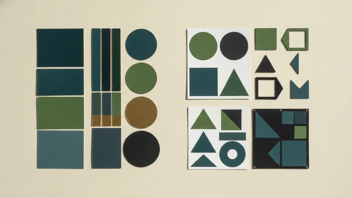
Color affects the mood of a real estate logo. Blue often suggests trust, calm, and skill. Green can suggest growth, nature, or an eco-minded service.
Black and gray can create a clean, strong, or high-end feel. Gold can add warmth and status when used with restraint. These colors are common, so your shade and layout must still feel distinct.
Start with one main color and one support color. Then test a black-and-white version. If the mark fails without color, its shape may need more work.
- Use deep blue for a steady, trusted feel.
- Use green for nature, growth, or local living.
- Use black or gray for a sharp, modern style.
- Use gold as a small accent for premium services.
Check contrast on signs, web pages, and printed cards. Pale gray may look fine on a screen but vanish on paper. Strong contrast helps the mark stay clear at a distance.
Use Typography To Set the Tone
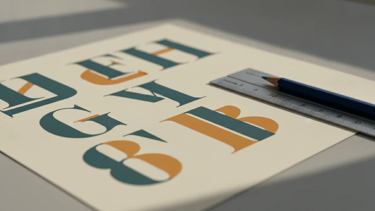
Typography gives the name its voice. Font choices should reflect the professionalism and style of your real estate niche. A clean sans serif can feel current and direct.
A serif font can suggest trust, history, or luxury. A script font may suit a warm boutique firm, but it can hurt legibility. Avoid using more than two typefaces in one mark.
Test the business name at small sizes. Thin strokes can disappear on a mobile screen or yard sign. Short names often work well in wider, heavier letter forms.
- Choose a typeface with clear shapes.
- Check every name letter at small sizes.
- Keep spacing even between letters.
- Pair fonts only when their roles differ.
Ask whether the name still reads in one quick glance. If not, simplify the type treatment. Clear type beats a clever but hard-to-read style.
Add Symbols That Support the Message
Symbols help people grasp your field at a glance. Houses, keys, rooftops, doors, and location pins are common choices. They can make the service clear for a new audience.
Common symbols can also look alike across many firms. Give a familiar icon a fresh shape or angle. A roof line with a strong cut may work better than a detailed house drawing.
Use visual symbolism with purpose. A key may suggest access, while a roof may suggest shelter. A simple horizon can point to place, growth, or a wide market.
- Choose one main symbol.
- Remove tiny parts that will not scale.
- Match the icon to your target market.
- Avoid icons that make false service claims.
Do not add a house just because the firm sells homes. The symbol should strengthen your brand story. It should also work without a long explanation.
Build the First Logo Concepts
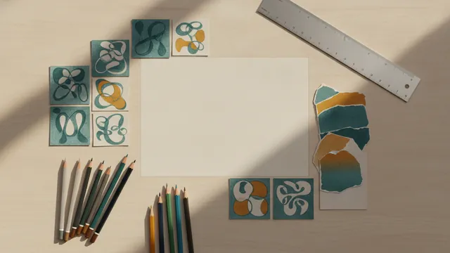
Now turn the brief into rough concepts. Start with black shapes and plain type. This keeps you focused on form before color adds appeal.
Create three to five different directions. Change the icon, type layout, and shape system between versions. Do not make five near copies of one idea.
- Sketch small ideas in ten-minute rounds.
- Choose the strongest three concepts.
- Build each concept in a vector design tool.
- Try horizontal, stacked, and icon-only layouts.
- Add color after the black-and-white review.
A good logo should be simple, memorable, versatile, and right for its market. It must work on a sign, website, email, and business card. It should also remain clear when reduced to about 24 pixels.
Keep the source files in vector form. Vector artwork can scale from a small profile mark to a large sign. Export web files in suitable formats after the design is approved.
Test the Mark in Real Settings
Testing shows whether the logo keeps its impact across media. Place it on a yard sign, listing page, business card, email footer, and social profile. View each sample at its real display size.
Check the mark from several distances. A sign should read from the street. A profile icon should remain clear inside a small circle or square.
Show the strongest two options to a small group of target clients. Ask what each mark suggests before you explain it. Their first response can reveal confusion that close design work may hide.
- Test full color, one color, and reversed versions.
- Check light and dark backgrounds.
- Review small, medium, and large sizes.
- Ask which traits people notice first.
Do not change the mark after every opinion. Look for repeated issues, such as poor type or weak contrast. Make one focused revision round, then test again.

Refine and Prepare the Final Logo
Refining means removing weak details and fixing balance. Check the space around the icon and name. Make sure no part feels crowded or too light.
Prepare a small brand pack for daily use. Include the main mark, icon-only mark, black version, white version, and color values. Add clear rules for minimum size and safe space.
Save files for both print and digital work. Use vector files for signs and print pieces. Use web-ready files for sites, listings, email, and social profiles.
| File need | Useful format |
|---|---|
| Print and signs | SVG, EPS, or PDF |
| Web use | SVG or transparent PNG |
| Social profiles | Square PNG with a safe margin |
| Single-color print | Black or white vector version |
Review the final files on real devices and printed samples. A polished mark should feel steady wherever clients meet it.
That is the practical path for how to make a real estate logo. Start with a clear brand, choose a fitting form, and test every choice. Good design comes from focused decisions, not from adding more effects.
How to do it
- Define the brandList your niche, clients, values, service area, and desired tone. Turn these points into a short design brief.
- Choose the logo typeSelect a wordmark, lettermark, emblem, symbol, or combined mark. Base the choice on your name length and planned uses.
- Set colors and typePick one main color, one support color, and a clear typeface. Test both choices in black and white.
- Sketch several conceptsCreate three to five distinct ideas. Try horizontal, stacked, and icon-only layouts.
- Build and test the markCreate the strongest concept as vector artwork. Place it on signs, web pages, cards, email, and social profiles.
- Refine and exportFix spacing, contrast, and scale issues. Save print, web, single-color, and icon-only versions.
Frequently asked questions
How do I create a real estate logo from scratch?
Begin with your niche, clients, values, and desired tone. Then choose a logo type, color set, typeface, and symbol that support those goals.
What type of logo is best for a real estate business?
Use a wordmark, lettermark, emblem, or symbol-based mark. A combined symbol and wordmark gives many firms the most flexible starting point.
What colors work best for a real estate logo?
Blue, green, black, gray, and gold are common choices. Pick colors that match your market and test them in black and white too.
How do I choose fonts for a real estate logo?
Choose clear type that matches your niche. Serif fonts can feel classic, while sans serif fonts often feel clean and modern.
How can I test a real estate logo design?
Test the mark on signs, websites, cards, email, social profiles, and dark backgrounds. Check both large and very small sizes.
What makes a good real estate logo?
Keep the mark simple, easy to recall, flexible, and suited to your target market. Remove details that vanish at small sizes.
Share this article
Related articles


Building something similar?
Tell us about your product — we respond within one business day with a concrete next step.