How to Create a Unique Artist or Makeup Artist Logo
Learn how to create an artist logo or makeup artist logo with clear steps for symbols, colors, fonts, testing, and use across every platform.
Why an Artist Logo Matters
To create an artist logo, start with the feeling your work should leave behind. Your logo acts as a visual sign for your brand identity. It can help clients spot your work across a busy market.
A strong mark does more than show your name. It sets a tone before someone views your portfolio. A bold shape may suggest energy. A soft curve may suggest care, beauty, or calm.
Think of the logo as one part of a wider visual identity. It should work with your photos, website, packaging, and social posts. It should also suit the clients you want to reach.
- Define the mood your work should express
- Choose a style that fits your best clients
- Build a mark that stays clear at small sizes
What Makes an Artist Logo Memorable?
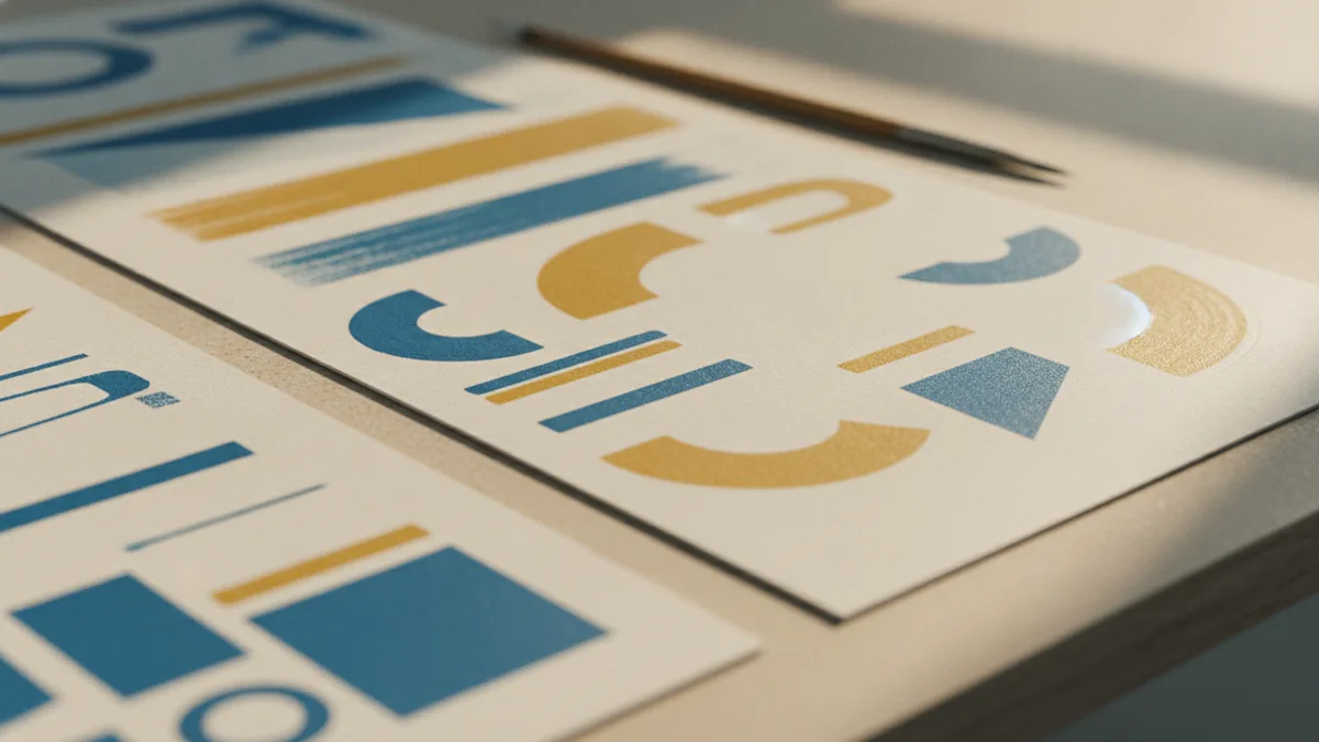
Memorable logos often use one clear shape or symbol. An illustrator might use a brush, line, or abstract mark. A painter might use a bold stroke or a simple palette shape.
For a makeup artist, a face outline, brush shape, mirror curve, or abstract eye can work well. Avoid adding every tool you use. One strong cue is easier to recall than a crowded group of details.
Unique shapes create room for difference. Search your market before you sketch. Review ten to fifteen competitor logos on websites and social feeds. Note common colors, icons, and type styles.
Use that research to find a gap. If most rivals use black script and gold, try a clean sans serif with a fresh color set. Do not copy a trend. Use it to make a sharper choice.
Keep the Shape Simple
A logo must work at many sizes. Test it at about 24 pixels for a profile image. Then test it at business card size and on a large sign. Fine details often vanish when a mark shrinks.
Use vector graphics for the final artwork. Vector files keep edges smooth when you scale them up or down. Ask for SVG, PDF, and high-resolution PNG files when the design is done.
Build Your Logo Through a Clear Process
Begin with a short design brief. Write down your art form, style, audience, and main promise. Add three words that describe your persona, such as bold, warm, and refined.
Next, collect visual references. Save colors, shapes, textures, and type styles that fit your brief. Group them into two or three mood boards. Each board should support one clear direction.
Sketch at least twenty rough ideas. Work in black and white first. This step helps you judge the shape without color doing all the work.
- Write a one-page design brief
- Study competitor marks and note open gaps
- Make rough sketches in black and white
- Pick two or three strong concepts
- Build clean versions in design software
- Test, revise, and prepare final files
Choose two or three sketches for a first draft. Keep each draft focused. A client should understand the idea within a few seconds.
Useful software tools include Affinity Designer, Adobe Illustrator, and Figma. Pick tools that let you edit shapes, type, and color with care. The tool matters less than the clarity of the design.
Choose Colors and Fonts That Fit the Style
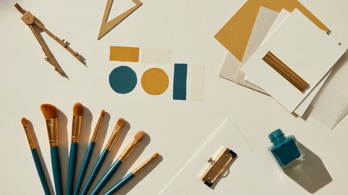
Color theory can shape how people read a brand. Red may feel bold or urgent. Blue can feel calm and trusted. Pink may suggest softness, beauty, or play.
These effects are not fixed rules. Culture and personal taste also shape color response. Test each choice with your target audience. Start with two main colors and one accent.
Build a black, white, and one-color version too. These versions help with stamps, invoices, embroidery, and low-cost print work. Your logo should not depend on color alone.
Match Typography to the Artist
Fonts also send a message. Serif fonts can feel classic and crafted. Sans serif fonts can feel clean and modern. Handwritten fonts can feel personal, but they may lose clarity.
Choose no more than two type styles. Give the name enough space to breathe. Check every letter at small sizes, especially in a social profile image.
For a makeup artist, pair a refined name style with a plain supporting font. This mix can feel polished without harming readability. For a street artist, a rough display style may fit better.
Design for Social Media, Print, and Websites
Your logo needs more than one layout. Make a main horizontal version for your website and business card. Create a stacked version for narrow spaces.
Also make a symbol-only version for profile images and app icons. A small mark often works better than a full name in those spaces. Keep the key shape visible inside a round crop.
Plan a safe area around each version. This empty space stops nearby images and type from crowding the mark. A simple rule is to leave space equal to the height of a key letter.
| Use | Best version | Useful file |
|---|---|---|
| Website header | Horizontal full mark | SVG or PNG |
| Social profile | Symbol or stacked mark | Square PNG |
| Business card | Horizontal or stacked mark | PDF or SVG |
| Packaging | One-color mark | SVG or print PDF |
Keep the same color scheme, type choices, and spacing across each use. This builds branding consistency. It also helps clients link separate touchpoints to the same artist.
Test Drafts and Use Feedback Well
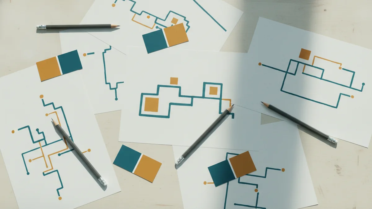
Good logo design grows through several drafts. Show two or three clear options instead of ten weak ones. Ask focused questions about mood, clarity, and fit.
Ask viewers what they notice first. Then ask what kind of artist they think uses the mark. Their answers can reveal a gap between your goal and the design.
Test the mark with five to seven people from your target audience. Include at least one person who does not know your work. Fresh eyes can spot confusion that friends may miss.
- Does the mark suit the artist’s work?
- Can viewers read the name at a small size?
- Does the design look different from local rivals?
- Does the color still work in black and white?
- Would the audience trust this style?
Do not change the design after every comment. Look for repeated themes instead. If four people call the mark hard to read, fix the type before changing the symbol.
Finalize and Put Your Logo to Work
Before approval, check the shape, spacing, color values, and type. Ask for a brand file set with clear names. Include light, dark, full-color, and one-color versions.
Save an editable master file. Keep a folder with web files and print files. This will save time when a printer, web designer, or social platform needs a new size.
Use the mark in your website header, portfolio cover, email sign-off, and social profile. Add it to invoices and business cards when it supports trust. Do not place it on every surface at once.
Review the logo after three months of real use. Check which versions stay clear and which need work. A careful launch gives your artist brand a strong base for future growth.
How to do it
- Write a design briefDefine your art form, target audience, style, and brand mood. Choose three words that describe your persona.
- Research nearby brandsReview ten to fifteen competitor logos. Note repeated colors, symbols, and type choices, then find an open design gap.
- Sketch simple ideasMake at least twenty rough sketches in black and white. Pick two or three concepts with clear shapes.
- Build clean draftsCreate polished versions in design software. Try two color sets and no more than two type styles.
- Test the draftsCheck each design at small and large sizes. Ask five to seven target viewers about clarity, mood, and fit.
- Prepare final filesExport full-color, dark, light, and one-color versions. Include horizontal, stacked, and symbol-only layouts.
Frequently asked questions
How do I create an artist logo?
Start with your art form, target audience, and brand mood. Sketch simple symbols that connect with your work, then test several drafts.
How do I create a makeup artist logo?
Use one clear cue, such as a brush, eye, mirror, or abstract face shape. Keep details low so the mark stays clear at small sizes.
How can I make my artist logo stand out?
Research ten to fifteen rival logos first. Note their colors, symbols, and type styles, then choose a clear gap for your design.
What colors work best for an artist logo?
Use two main colors and one accent at first. Pick colors that match your style and test a black-and-white version as well.
How should an artist logo work across platforms?
Make a main version, a stacked version, and a symbol-only version. Test each one on social profiles, websites, and printed cards.
How do I test an artist logo before launch?
Show two or three drafts to five to seven people in your target audience. Look for repeated feedback about clarity, mood, and fit.
Share this article
Related articles



Building something similar?
Tell us about your product — we respond within one business day with a concrete next step.