
Audit & Strategy
Visual audit of existing UI, brand alignment review, and design system gap analysis.
- Visual consistency audit report
- Brand and accessibility alignment
- Design system scope definition
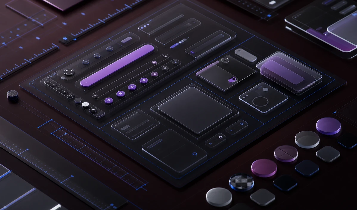
Beautiful, functional user interfaces that guide users to their goals without friction — built on a systematic component library that scales with your product.
Visual design and brand alignment
Component library and design system creation
Design tokens and theming architecture
Responsive and adaptive layouts
Interactive high-fidelity prototypes
Design-to-code handover with specifications
Visual audit of existing UI, brand alignment review, and design system gap analysis.
Tokens, primitives, and component library built in Figma and documented for engineering handover.
High-fidelity screens designed with the component library — every state, breakpoint, and edge case covered.
Developer-ready specs, assets, and implementation support to ensure the design ships as intended.
Drop us a line and we'll respond within one business day with a suggested next step — no strings attached.